
I’m safely back home after a long but exhilarating journey to Ireland where I fell in love with the country and especially the people. It was truly a trip of a lifetime.
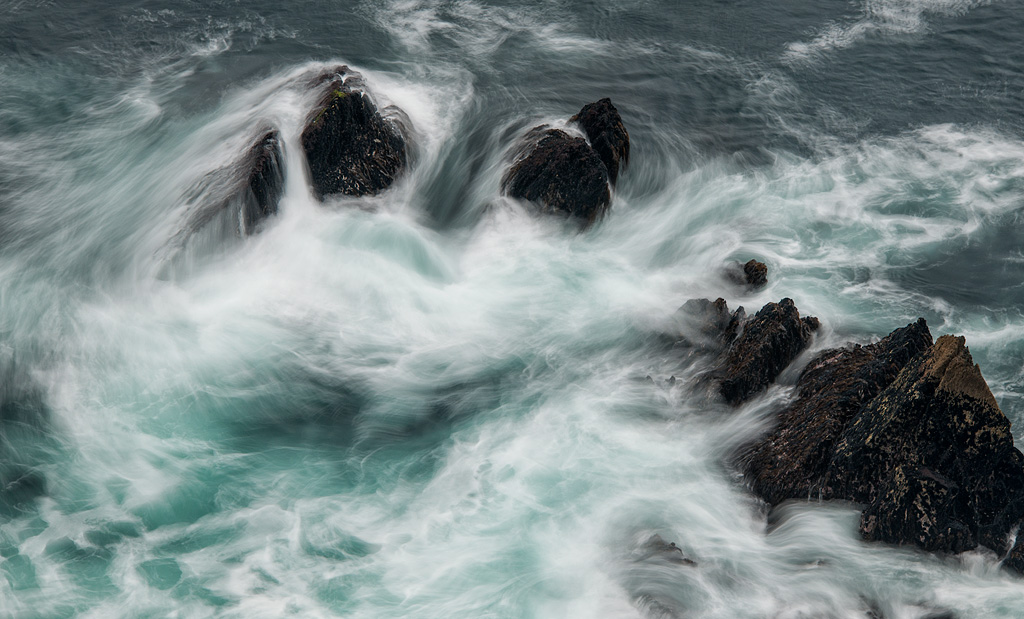
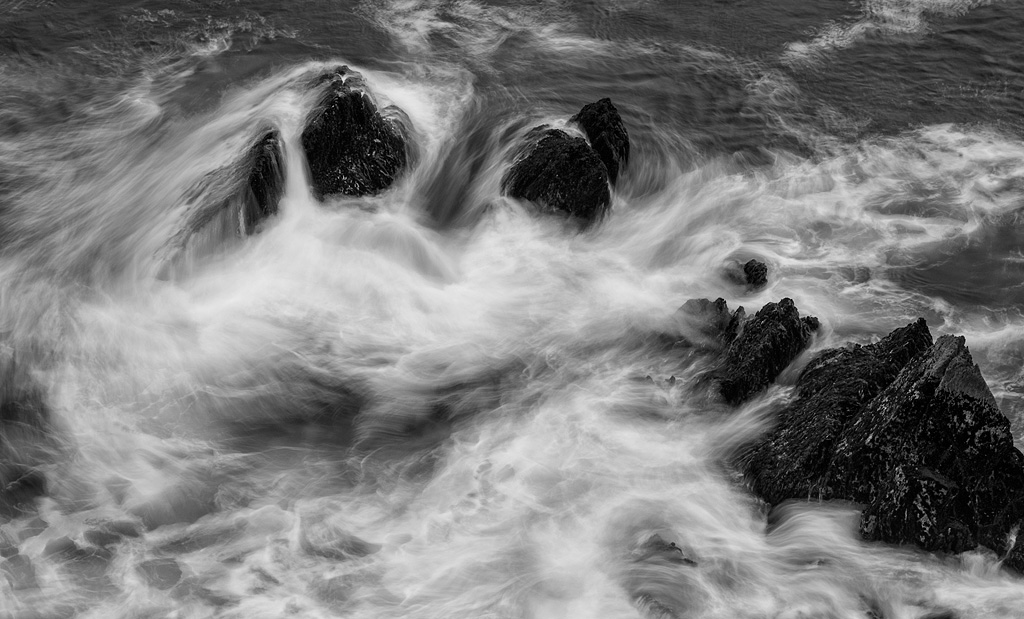
We visited Peter Cox’s gallery in Killarney, where he has some incredible images. A few had long exposures of rocks in the ocean. At this location, I thought I’d give it a try. I’m attaching a B&W version for your feedback. I think they both work.
[jamiesocial]
I think they both work… But I absolutely LOVE the gorgeous blue tones surrounded by the smoothly swirling waves in lower left quadrant of the color version. Marvelous!
You are correct JB, either work. I like them both, but maybe the color one a little more. But then the B&W one is cool, so I don’t really know! Glad you are back and had a successful trip.
Trip of a lifetime Scott. Amazing country. I’ll go back for sure.
As others–really like the color version though, seems to have a little more depth and like the muted, subtle color. I follow your work and admire you for your vision and sensitivity-and lets not forget your skies. Would like to cross paths sometime.
Thanks for your thoughtful comment Dennis. Maybe a tour or workshop?
I prefer the color since the blues are so subtle and soft. But both are beautiful. Enjoyed all your images from Ireland. I must get there some day – hopefully on a JB/DS photo tour!
Both are great, Super shot!
Have to say I prefer the B&W, just because it feels more moody and I can see the patterns more clearly.