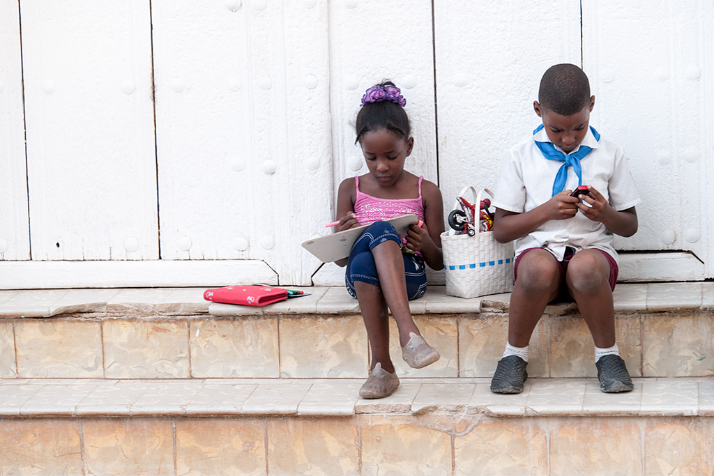
I’m going with B&W for two reasons… Both tell the story but in the color image, my eye is drawn to the brightly colored book next to the girl. In the B&W, I’m drawn to the schoolchildren. The second reason is that whatever you did in the B&W conversion, it worked to make the boy stand out better against the white wall behind him. I haven’t processed my capture of these two yet but will look at it with new eyes when I do get to it! 🙂
Wayne had difficulty posting and sent this private message…
I like both with a slight preference for the colour. The colour seems to fit the colourful subjects. I would also like to see girl, boy, purse & basket in colour and the
rest in B&W.
Wayne
The colored version would be my vote JB. Although the B&W speaks of times gone by, the young lad playing with what appears to be a 20th century game clearly brings it current , as does the colorful power ranger type toy in the basket. Actually there are so many things in the colored version that stand out. Just my humble opinion of course….:)
I definitely prefer the black and white. The colors in the color version I think distract from the mood and emotional impact of the image. The feelings of relaxation and concentration come through brilliantly in the b&w version.
As much as I like the B&W, I think the color photo really brings your attention to the children and what they are doing. The colors are bright enough to draw your attention but not bright enough to distract you from the children.
My vote, and always my preference, is for the b/w image. Here is works especially well because of the large expanse of white wall behind the two subjects.
That said there are issues with the image as shown though:
1-If you go with the color version, then the wall needs to be white not mildly cyan.
2-Straighten up the image – the grout lines in the tile and the gaps in the wall are parallel.
3-Dodge that wall to bring out the texture in it. That adaptive exposure slider in Topaz B/W does wonders.
4-On the email posts make these images smaller and side by side so the viewer doesn’t have to scroll up and down repeatedly.
Love the concept of this type of viewer involvement. We’re going to incorporate this into our new website/blog design and marketing plans.
Hello Mike, Thanks so much for a thoughtful reply. All very good suggestions. I’m a big Topaz fan and I will be doing yet another webinar for them in a few weeks. 🙂
I love both pictures and I think it would depend on where the picture is being used on which one is best. On the one hand I love the way the colors give distinction to the items in the photograph; on the other hand the B&W captures the attention in the right publication or posting. Great photograph.
I’m with you Carton. It is indeed straight. I was standing at an angle… That said, if you follow my work and blog you’ll know I’m not a fan of one right answer… meaning, there are many right answers and everyone is likely to see the same scene in a different way. The end result, ANOTHER RIGHT ANSWER! 🙂
It seems to me that the color photograph is more human – there seems to be a natural warmth, and empathy, between the siblings (I am ssuming) which the color in so many ways seems to support. The color is all about the relationship of the people in the photograph. The black and white in my mind, depersonalises a tad: its become more about geometry and setting, balance and symmetry, as the lack of color shifts us away from the two people into a more inclusive and wholistic dynamic. The B&W version is much more about the photograph in total, whereas the color version seems to exemplify the relationship between the two protagonists… 🙂
Much to my surprise, I prefer the color version. The subtle tan of the steps gives it more apparent depth than the b/w version, and the bright colors i the clothing create a relationship between the children that I feel is lacking in the b/w where they look very isolated.
Black and white on this one. I see more the children in the B&W photo than in the color. My eye was immediately distracted from the children by the colors although on further review I believe their faces were lighter in the B&W.
JB, the color version brings more life into the image. I’m not crazy over the tones in the background. May I suggest, B&W for background. This way the children will stand out even more.
JB, it doesn’t look like you need another vote, but I’ll cast one anyway for the color version. My personal preference is color for children unless you are going for a moody, pensive shot. All I see here are two happy kids immersed in their toys and oblivious to the serious world around them. Bring on the color! I also like the way the colors in this image play off each other. They color combo is so good that it almost looks staged.
My first preference was for the color version mainly because of the bright clothing but as I kept panning back and forth between the two versions my eye was drawn more and more to the pink book next to the girl. Maybe you could tone this down or even as Linda suggested make everything but the children B&W.
Having and seeing the available choice, I personally prefer the color as there are slight traditional aspects such as the pink for the girl and blue for the boy. The red book… Red always adds to a picture! The purple hair piece in her hair… And the compliment flow of blue weave in the basket and the red motorcycle within … This is almost too planned out – such as an artist would visualize this and paint the colors and flow – yet it is not. The color of their skin is also amazing – you had awesome soft and reflective lighting conditions.
To add to your inquiry of thoughts for this image, I would also suggest a crop … either square or horizontal. After shooting with 6×6 film and the Hasselblad for over 30 years, thinking and seeing square becomes an option or to crop horizontal or vertical in post darkroom work – the beauty if shooting 6×6 and choosing thereafter!
All in all, it is awesome to have an image that is strong and powerful enough to have so many possibilities and options. And the power yo be either B&W or color. That does not always happen. Here you can choose just about any option and you would still have an amazing image. Powerful work JB! The new Topaz looks amazing!
I think the color version tells the greater truth. These are hip and stylish modern kids. The b&w version implies otherwise and refers to a past that belies the reality of who these particular children are.
Hard to choose since both versions are excellent. Nonetheless, I would vote for the color shot. It has a delicate mood about it that befits the ages of these children. There is also a subtle quality here that reminds me of Kodachrome…which I miss very much. 🙁 Looking forward to your March 7 webinar. Slainte!
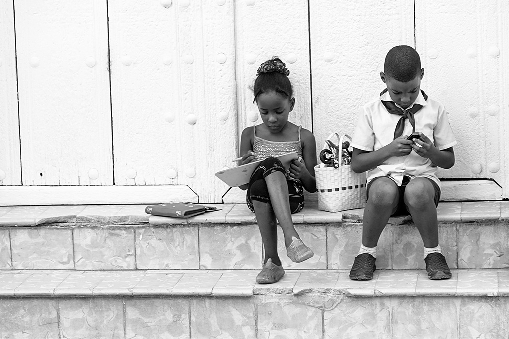

I’m going with B&W for two reasons… Both tell the story but in the color image, my eye is drawn to the brightly colored book next to the girl. In the B&W, I’m drawn to the schoolchildren. The second reason is that whatever you did in the B&W conversion, it worked to make the boy stand out better against the white wall behind him. I haven’t processed my capture of these two yet but will look at it with new eyes when I do get to it! 🙂
Thanks Victoria. Always appreciate your feedback.
B&W defo!
Wayne had difficulty posting and sent this private message…
I like both with a slight preference for the colour. The colour seems to fit the colourful subjects. I would also like to see girl, boy, purse & basket in colour and the
rest in B&W.
Wayne
Color, I love the girl in pink and boy in blue, so traditional and classic.
Thanks Dr. Lebby. 🙂 Yup, traditional school dress which is color coded for the various levels of school.
The colored version would be my vote JB. Although the B&W speaks of times gone by, the young lad playing with what appears to be a 20th century game clearly brings it current , as does the colorful power ranger type toy in the basket. Actually there are so many things in the colored version that stand out. Just my humble opinion of course….:)
Your humble and very valued opinion Dorine!
I definitely prefer the black and white. The colors in the color version I think distract from the mood and emotional impact of the image. The feelings of relaxation and concentration come through brilliantly in the b&w version.
Appreciate the feedback Rich.
Like the black and white better. I think bw is better for portraits. Color is distracting. Imho.
As much as I like the B&W, I think the color photo really brings your attention to the children and what they are doing. The colors are bright enough to draw your attention but not bright enough to distract you from the children.
Thanks Tom. I too like B&W for portrait work, however, there are times for color…
Thanks Bonnie. Always appreciate your comments.
My vote, and always my preference, is for the b/w image. Here is works especially well because of the large expanse of white wall behind the two subjects.
That said there are issues with the image as shown though:
1-If you go with the color version, then the wall needs to be white not mildly cyan.
2-Straighten up the image – the grout lines in the tile and the gaps in the wall are parallel.
3-Dodge that wall to bring out the texture in it. That adaptive exposure slider in Topaz B/W does wonders.
4-On the email posts make these images smaller and side by side so the viewer doesn’t have to scroll up and down repeatedly.
Love the concept of this type of viewer involvement. We’re going to incorporate this into our new website/blog design and marketing plans.
Mike
Hello Mike, Thanks so much for a thoughtful reply. All very good suggestions. I’m a big Topaz fan and I will be doing yet another webinar for them in a few weeks. 🙂
I love both pictures and I think it would depend on where the picture is being used on which one is best. On the one hand I love the way the colors give distinction to the items in the photograph; on the other hand the B&W captures the attention in the right publication or posting. Great photograph.
I forgot to add that I believe the photo itself is straight. Look at the horizontal lines which run even with the horizontal plane in the photo.
I’m with you Carton. It is indeed straight. I was standing at an angle… That said, if you follow my work and blog you’ll know I’m not a fan of one right answer… meaning, there are many right answers and everyone is likely to see the same scene in a different way. The end result, ANOTHER RIGHT ANSWER! 🙂
Color.
You have many colors in the shot.
Thank you Vincente.
It seems to me that the color photograph is more human – there seems to be a natural warmth, and empathy, between the siblings (I am ssuming) which the color in so many ways seems to support. The color is all about the relationship of the people in the photograph. The black and white in my mind, depersonalises a tad: its become more about geometry and setting, balance and symmetry, as the lack of color shifts us away from the two people into a more inclusive and wholistic dynamic. The B&W version is much more about the photograph in total, whereas the color version seems to exemplify the relationship between the two protagonists… 🙂
An excellent, thoughtful response Jack. Thank you.
JB
The b/w is a more compelling image. The colors are no longer a distraction. Some images just scream, “Black and White!”
Thanks Josh.
Much to my surprise, I prefer the color version. The subtle tan of the steps gives it more apparent depth than the b/w version, and the bright colors i the clothing create a relationship between the children that I feel is lacking in the b/w where they look very isolated.
MWS is in the house! Thanks Terry… oops… MWS.
I love B&W, but for this image I think the color enhances rather than detracts. To my eye it seems to focus attention on the children.
Thank you John. Appreciate your feedback.
Black and white on this one. I see more the children in the B&W photo than in the color. My eye was immediately distracted from the children by the colors although on further review I believe their faces were lighter in the B&W.
Appreciate your feedback Lea.
JB, the color version brings more life into the image. I’m not crazy over the tones in the background. May I suggest, B&W for background. This way the children will stand out even more.
Good suggestion Linda. Thank you.
JB, it doesn’t look like you need another vote, but I’ll cast one anyway for the color version. My personal preference is color for children unless you are going for a moody, pensive shot. All I see here are two happy kids immersed in their toys and oblivious to the serious world around them. Bring on the color! I also like the way the colors in this image play off each other. They color combo is so good that it almost looks staged.
Always appreciate your feedback Debbi. Bring on the color!! 🙂
My first preference was for the color version mainly because of the bright clothing but as I kept panning back and forth between the two versions my eye was drawn more and more to the pink book next to the girl. Maybe you could tone this down or even as Linda suggested make everything but the children B&W.
Always appreciate your thoughtful feedback Mark.
Having and seeing the available choice, I personally prefer the color as there are slight traditional aspects such as the pink for the girl and blue for the boy. The red book… Red always adds to a picture! The purple hair piece in her hair… And the compliment flow of blue weave in the basket and the red motorcycle within … This is almost too planned out – such as an artist would visualize this and paint the colors and flow – yet it is not. The color of their skin is also amazing – you had awesome soft and reflective lighting conditions.
To add to your inquiry of thoughts for this image, I would also suggest a crop … either square or horizontal. After shooting with 6×6 film and the Hasselblad for over 30 years, thinking and seeing square becomes an option or to crop horizontal or vertical in post darkroom work – the beauty if shooting 6×6 and choosing thereafter!
All in all, it is awesome to have an image that is strong and powerful enough to have so many possibilities and options. And the power yo be either B&W or color. That does not always happen. Here you can choose just about any option and you would still have an amazing image. Powerful work JB! The new Topaz looks amazing!
John, re: b&w or color, I like them both. Different moods. Great shot.
I think the color version tells the greater truth. These are hip and stylish modern kids. The b&w version implies otherwise and refers to a past that belies the reality of who these particular children are.
A well thought out response. Thank you.
Hard to choose since both versions are excellent. Nonetheless, I would vote for the color shot. It has a delicate mood about it that befits the ages of these children. There is also a subtle quality here that reminds me of Kodachrome…which I miss very much. 🙁 Looking forward to your March 7 webinar. Slainte!
Kodachrome was indeed wonderful. Thanks for your thoughts Bruce.