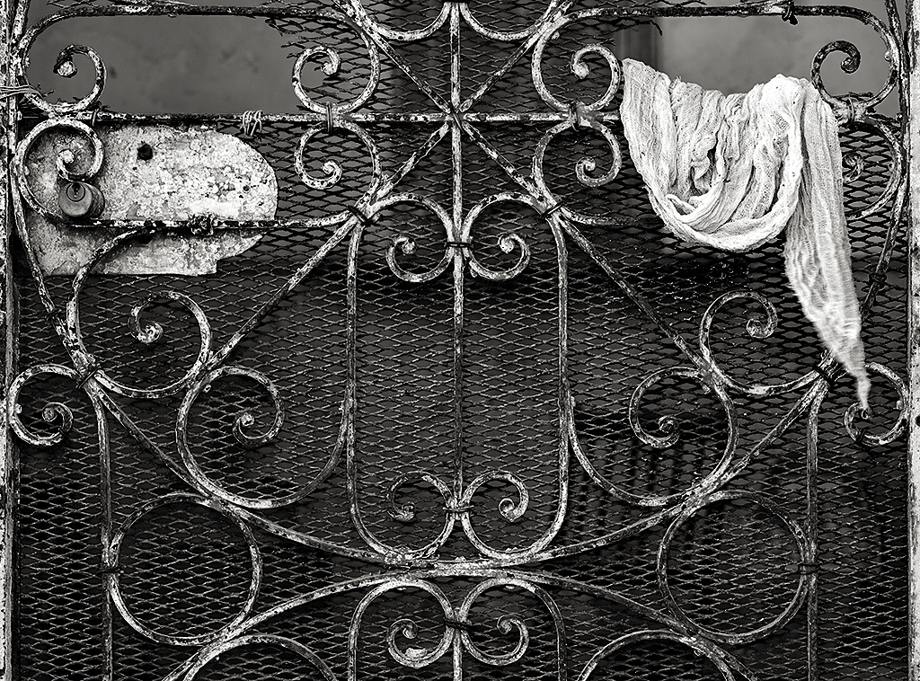
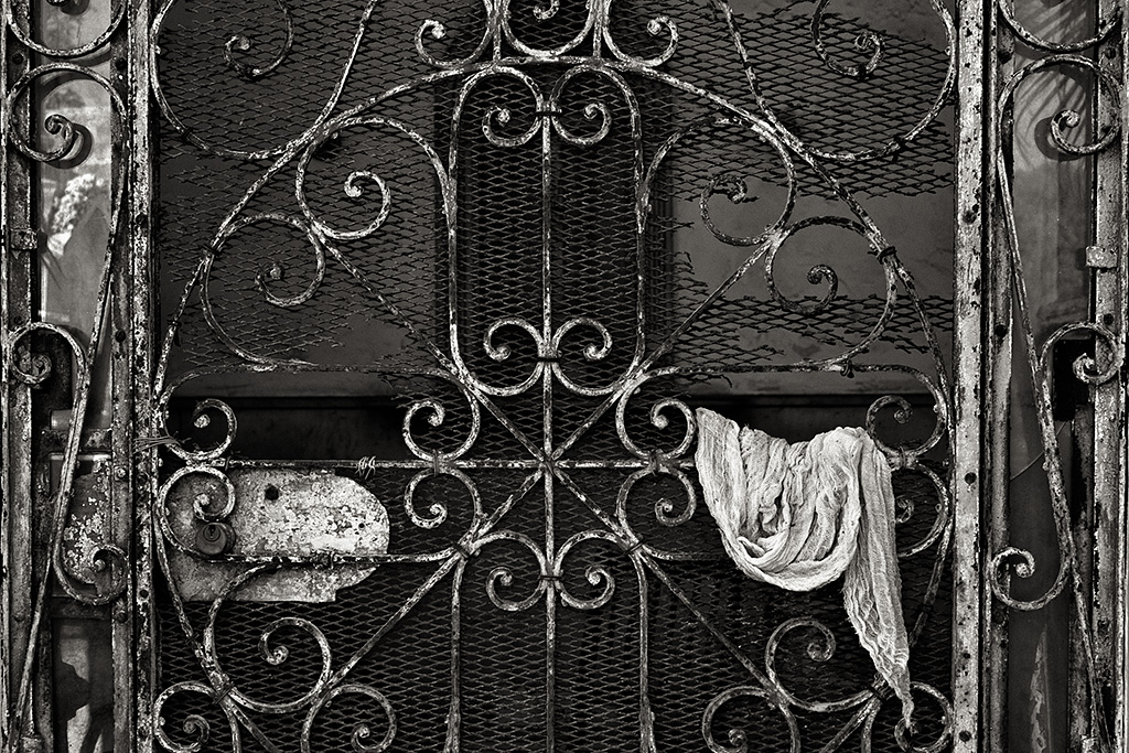
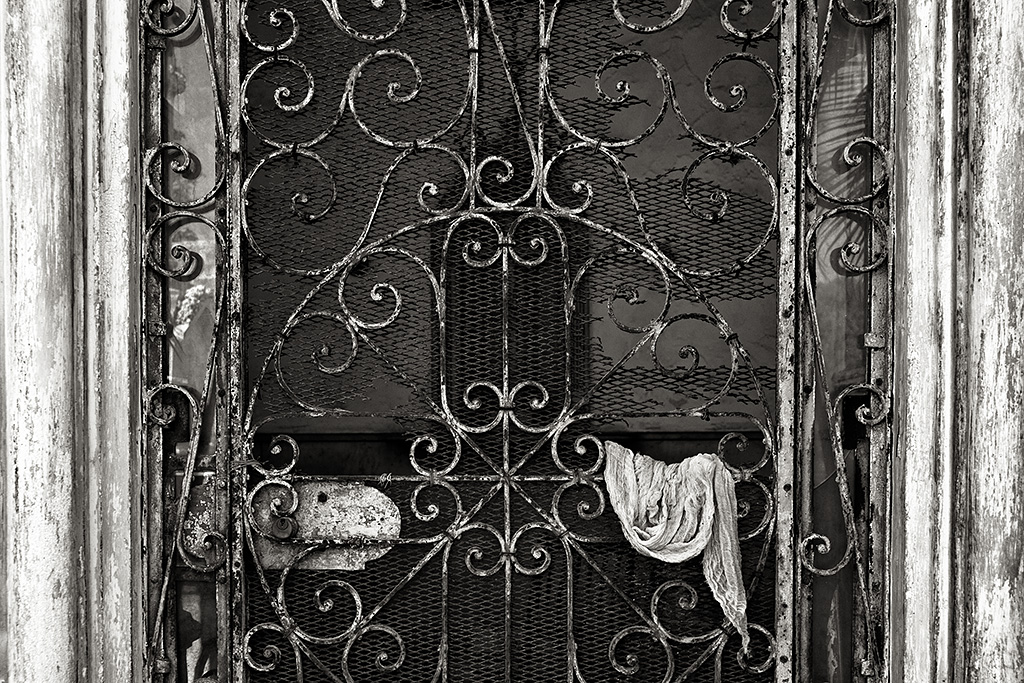
WOW! I asked for some feedback and you came out in droves! Thanks much for the thoughtful feedback on my last post, Color or Black&White? You were so good, I’ve decided to ask for your opinion again. The scene is a locked door on a small building at the Colon Cemetery in Havana. The rag hanging from the door caught the attention of my friend Stan. He showed me his shot which inspired me to go back to see how I might interpret it. I ended up with two that I liked enough to process. One being top weighted the other bottom. Then my choice was, do I include the door frame on the bottom weighted version or not? As a frequent commenter Stephan would say, choices and more choices! I look forward to your comments.


John, After looking at these 3 images , I felt it was between 1 & 2 . I chose #1 over # 2 because I think # 2 competed with the rag because of the wood fame. #1 really brought out more of the subject in which to me is the rag.
Thanks Sandra. Good observation.
I agree with Sandra and would add that the frame, in 2, really draws my eye to the exclusion of the rest of the image. In 1, I’m drawn into the image and find myself wondering where the person is who left the rag and am even pulled beyond the door further in to theicture. In 3, I cannot figure out where to look!
Good work Victoria! I tend to agree but I find it fascinating to hear about what others feel or see.
The movement of the rag (the wind?) in image #3 is distracting to me and takes away from the serenity of the image. #2 kinda feels like the main object is crammed in too little space. I’d go for #1, better image proportion overall but especially the image of the Holy Cross it seems to show.
#3. the viewer gets right to the essence of the shot. no distractions. rule of thirds helps the eye move across the shot via line, gets to the rag then drops down an circles back to the beginning. the viewer moves in this pattern until all is explored. some go around once or twice, some go around more.
Mr. PURVIS is in the HOUSE!!! Hey bud! Why did I know that you would have an opposing view?! Excellent feedback. Thanks Gerog.
An interesting exercise that just happens to coincide with recent reflection on personal work over the last year or so. Thinking about the what, why an how of my images that ended up as favs has lead to a more conscious realization of my artistic paradigms through which I view mine and other’s work. Turns out, through this process, I’ve become more aware of the relationship the subject and it’s context. And so we come at long last to your question about the rag. Of the three options you presented, I favor the first as it presents the better choice regarding subject and context. However, I’m left wondering if the best presentation might be one not shown: A square comp showing the entire cross in the circle with the rag in the lower right. In other words, the third image you presented is the lower half of the comp I’d like to see.
Donnie, I really like what you’re doing with your personal work. It is a good thing to do. Review with purpose and a desire to learn and grow. Great feedback on this series of images. I don’t have the image you’re looking for but maybe I could stitch it together? 🙂
#3. The image is about both texture and pattern and “less is more”. Even the part of the doorway in #1 is too much. The strong rising curve is just …. elegant.
I don’t think the door frame does anything for the composition except confuse my eye! I agree that the best one might be the one not posted. Square, with the circle. To me the subject is the wrought iron with all of it’s weathering and delightful patina. Close is better, and you still emphasize the interesting rag as your focal point.
Thanks Scott. Appreciate your valuable input.
I prefer the image with the rag on the bottom, it somehow seems more balanced to me.
Thanks Tom. I tend to agree and I do feel balance is very important in images.
John, I prefer the last image – the most cropped one. Seems more dynamic to me and brings out the texture of the rag.
Thanks Steve.
JB
I like the last image. It’s no doubt what you want the viewer to see and/or feel. The rag now becomes more of a central player and breaks up the rhythmic pattern of scroll work. The overall composition feels more vibrant.
Hey Josh! good thoughts.
Being the a symetrical person I am, I really like the bottom weighted one, without the door frame. I like it without the door frame, because it brings my eye right to the rags. Nice work.
Appreciate the feedback Nicki
I choose #1 as I believe it to be a stronger composition free of distractions. Fantastic work.
Thanks Dan.
Well I guess I should chime in since you credited me with inspiring you to process your images. I like # 1 best. However, the problem I have with all 3 is the light part of the gate on the left side. I find it distracting
as for me, the subject is the rag. Here’s my version: http://500px.com/photo/24636127
Thanks for the credit John.
Stan
Good feedback Stan. I’m okay with it in image #1 as it add balance… but I do agree it might draw the eye to it as well…. hummmm…
I’m with the above posts who prefer the last image. The scroll work is strong enough that it does not need a framing (literally) device of either the inner door, & especially the light tone of the outer door, which in my view actually deteracts. The rag is balanced by the plate around the lock. The expanded metal diamond pattern holds it all together. The scroll work is allowed to present itself simply for what it is.
Marty!! Always appreciate your expert opinion.
The CHOICE is yours! You are the creator of your images. You stand by and behind the work you create. What you see and what you ultimately capture is your interpretation of what you visualize. With infinite choices in every given moment and without the ability to be duplicated, we are left with infinite more choices for the next time – or for others to find, discover and capture thereafter.
I like all of your choices and see more possibilities! Wish I was there! Glad that Stan shared his visions with you and that you shared yours! Infinite choices!
The beauty and gifts of photography, art and sharing the treasures we choose to record, create and find. The choices are yours and ours!
PS: I personally like version number one. But all versions show the possibilities of additional versions and choices. The rag adds great balance to the image. Whoever placed it there knew what they were doing (think of all the possibilities where the rag could be hung from). Stan’s image is awesome as well and emphasizes the rag. Again, awesome that you went back and have your stories to show-and-tell!
I’m late to the ‘party’ (but isn’t that fashionable??) but here’s my take. Image #1 works well because we enter the frame from top left (the way we read in western cultures), in this case you have created a composition that brings across all the wonderful scroll work as we get to the rag. We end on the rag, the focal point in this picture, but not before seeing the rest of the image. It’s a traditional balance and comfortable for us. In Image #3, we come into the picture across the light lock thing, across to the rag, and while we do look at the rest of it, the eye keeps getting pulled back to that upper right – resulting in some visual tension. There’s also a little tug of war between the lock thingy and the rag, once we’re ‘in’ the picture. But that could be remedied with a toning down of the lock thing…still, there’s a tension here. So for me, #1 is the choice. (I also like Stan’s a lot, too).
Thanks for your thoughtful reply Brenda.