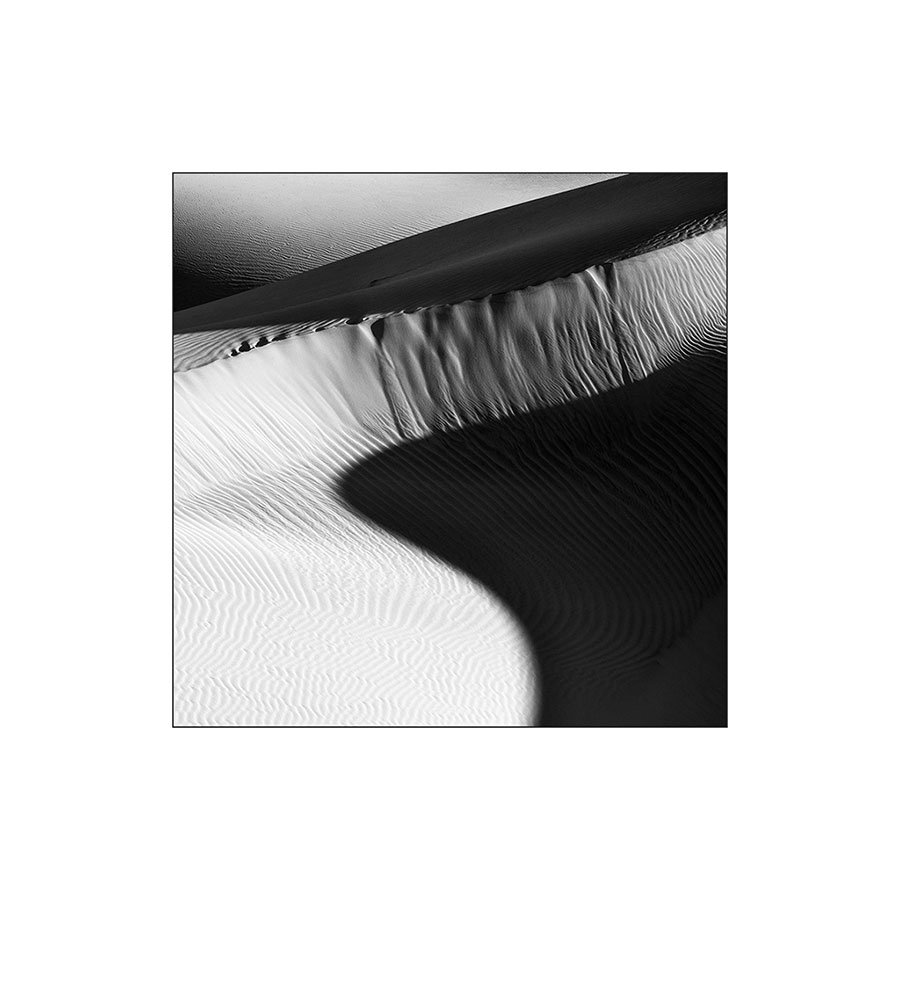
In the film days there was a rule that you had to show exactly what you shot. In the digital age, things have changed a bit. THANK GOODNESS! Don’t get me wrong, I still think its a good idea to be careful about your composition in camera. Its also a good idea to make the proper exposure and even use filters where you can. Getting it right in camera is still a good concept! That said, I have been liberated by the digital world. While in the field, I find myself thinking about cropping the frame in post processing. Lets face it, sometimes the 2×3 format gets in the way. Oh and by the way, isn’t the format of the camera a crop? Moving on…. This is when I consciously decide to include more on one side and commit to cropping out the unwanted when I process. Or sometimes I include more knowing I’ll need to fix a perspective issue. Or, sometimes I am frustrated that I don’t have enough reach with my longest lens and remember I have 24 megapixels in my D3x and I’ll be able to crop to the image I’m seeing.
With this image, I saw a square. Below is the full frame and an alternate crop. Always interested in your thoughts on which composition you prefer.


Image 2 is far more interesting.
Image 1 is good but my eye wanders too far.
Thanks for your feedback Bob. Much appreciated.
I think the cropped image is much more arresting and engaging. I’ve been told only “incompetent” photographers crop. I’m so glad to be free of such limiting preconceptions!
Thanks Louise.
I heard that ‘rule’ from the film days too… a lot. In particular when my work was being viewed. Always thought that ‘rule’ was BS, still do. Never followed it, still don’t, film and/or digital. I like the square, or nearly square, image the best. In general, successful composition in a square(ish) image is more difficult that more tradtional proportions. Many years ago a comment was made to me by a highly respected AD of a highly respected photographic book publisher, saying to the affect that if one can compose well to the square format one shouldn’t have much difficulty with any other format. Square was his favorite format as well.
Thanks for your reply. Yup square is fun!
Definitely the first, to much bright area in the full frame. Still to much in the third. The first, winner winner chicken dinner.
Winner winner chicken dinner? Really?? 🙂
When I first saw the cropped image, I had my mind already made up that I would like it more, because I like it a lot. As I scrolled down and saw the full view, I changed my mind. I actually like both, and don’t have a preference. Both are great in their own right.
Thanks David
Love the square crop. It just defines the dune. A fav.
Thanks Ms. Lovegood. 🙂
The square crop seems like it really makes the image pop. Even though it’s a smaller image, it draws you into it so much more. I like the bottom crop the best, it has such nice clean lines, where your eyes can travel.
I prefer the square image. And square can be fun and a challenge. I miss my square format Hasselblad which i sold when I went digital. But I don’t miss it enough to go back to film.
Nice image!
Thank for chiming in Tom! I sold a Hasselblad too…. 🙁
OK, I’m going to be the contrarian here. The uncropped version seems “grander” to me. And with the cropped verions you miss that dark hump in the upper left hand corner that balances nicely with the lower right hand corner. They’re both great but I’ll take the original.
Of course you would Stan.
great “matte” also
Like the square; it’s all you need!
JB
Again, a striking image! Concur with the crop. I just said in a flower photography workshop at Longwood that it’s OK to crop square.
Square works!
I’m drawn to that perspective more and more.
Nice work…effective composition.
Very nice images, regardless which version.
What strikes my eye in the first is the yin/yang resemblance of the lower bright/dark sections. Might crop a slight amount from the top/slightly each side (to keep square) to emphasize that a bit.
The last crop strikes me as the diagonal brighter sections (lower LH to upper RH) vs the diagonal darker sections (lower RH to upper LH) squeezing the center section. With this view, a bit too much bright lower LH section.
In the full frame, if crop approximately bottom third+, has similar diagonal squeezing as above, but emphasizes the best textured area. Clearly not square, buy simply as a matter of taste, I prefer this.
Thanks Marty. I will be posting a revision to the full frame based on excellent feedback from Chuck.
John, your shot reminds me of Ansel Adam’s observation that the negative is the (musical) score. The rectangular crop has an overabundance of high notes which overwhelm all the other tones. In contrast, your square arrangement delicately balances low, mid-range, and upper register notes. The difference in the two is dramatic. And thanks for reminding me how much I loved my Mamiya C330.
Square is my preference hands down. When I crop square, I fantasize having a Hasselblad :-))
I understand Jack! 🙂