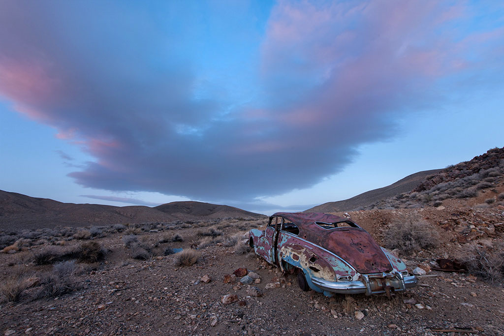
In looking back at my last ten blog posts, I realized I’ve been in B&W mode! I figured it was time for a color image. This one is from the abandoned Eureka Mine area. On our scouting day we had a cloud that was cooperating and the sun even reflected a hint of color as it disappeared over the horizon. I scurried up the hill to the car, moved to a position where I could best use the cloud, and make just a few captures as the light faded.
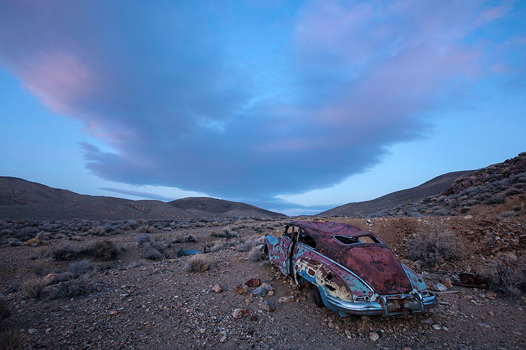
A teaching moment if I can. I’ve included an alternate version of the posted image below. In it you will see the sky had more color which I preferred. The issue I had was, in my haste after running up the hill to catch the color, I was not paying attention to where the car was in the frame. Below, you’ll note is was merging with the sky just a bit. I quickly changed my position to fix the issue but lost some of the color. Its a small nit picky thing, however, I was reminded by Tony Sweet this weekend (we presented together for a group along with Denise Ippolito) how important being nit picky is. A friend I was sitting with said, “thats what separates Tony from the rest and makes him so good.” I agreed.
Be sure to check back as my next post will be by guest blogger and Master Black & White photographer Chuck Kimmerle! Shout it from the roof tops, tell your neighbors, tell your friends, tell your mom, dad and siblings too… Everyone will want to read his great post.


Yep, makes a world of difference….
Both shots are awesome! I think the “merger” with the sky is irrelevant. In the other shot the car merges with the dirt — so what?? Great shots, John!
Fair enough Rich. Lets see what others have to say. To me it makes a big difference.
P.S. I like the “merger” better!
OKAY!! 🙂
I’m torn between the 2 shots- although the sky is better in the merge, but I like the detail in the car better in the first shot. Maybe it was just in the processing. I would have to choose the first one, I really love the way the car pops, and to me, I would choose the car as being the subject, and the sky an added beautiful bonus. Great shots.
Definitely the second one. Glad you caught that, John.
My opinion,as best, is the “Merger”–it has a feel that time has now absorbed the car as part of the landscape, not an object placed in a perfect thirds composition grid. The mood is fantastic!!!!!
Normally, I would agree that the merger would not be desirable. However, in this example it seems just fine because the contour of the cars roof seems to mirror the contour of the horizon. In other words it doesn’t seem to be a distraction at all, in my humble opinion.
Thanks for the feedback Bill. I do think its a minor nit but still worth pointing out for cases where it will indeed make a BIG difference.
My two cents: I like the second one much better, even though the merge rule is broken (I agree the concept/rule is generally good idea). In the first instance, rule applied, the car looks lost in the dirt. In the second, the car becomes a much stronger foreground element to my eye and better leads the eye to the cloud. Now had the car merged with the main body of the cloud I would agree that would have been a more egregious offense. In other words, the composition is about the interplay between the car and the cloud, not the dirt horizon. The colors between the car and the cloud are great and the repeating “V” shape of the cloud and the lines on the car are very pleasing.
A well thought out comment Donnie. Thanks for chiming in.
The main issue with the placement of the car in the first photograph is the lack of definitive tonal/color separation between the rusted car roof and the background dirt. In other words, it sorta gets lost. By placing the outline of the car into the sky, just below the thin line of clouds, John has given the car the start of an outline which helps strengthen the car’s admittedly subtly presence.
Good Morning, John!
I completely agree with you regarding the “nit” and found your preferred version substantially better than the alternative composition. Why? Because the placement of the car in the first shot allows one to see that far off gap between the hills. It looks as if that rusted out old hulk is headed that way…in its dreams. 🙂 In the second shot the car is simply there, static, dead. The better composition draws the eye into the far distance of the scene. Not so with the other one. Nice work, as always. Slainte!