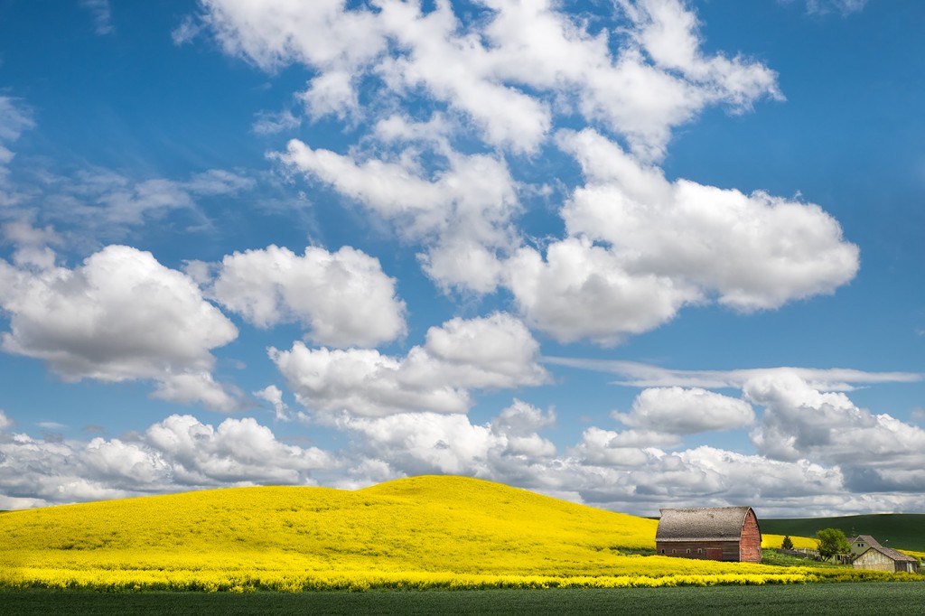
At the end of my recent Topaz webinar, someone asked a good question. How do you know when to convert an image to B&W? I gave an answer, however, since then I’ve been thinking more about it. I have an answer, but, I’d like your input. I’m curious to know your thoughts on this subject. Here is my current answer, which I’m sure will morph and change over time. B&W needs to be a purposeful choice. One does not just tap the “V” key in Lightroom to convert it and then walk away. It should be done with a bit more purpose. Typically I ask myself, what role does color play in my image? If it is important, I will most likely keep it color. The image below is a good example. For me, the color is a very important part of the story in the Palouse. The yellow canola, the red barn, blue sky, green wheat. All big players in the overall composition. Yes, this is the same red barn seen in the distance in my last blog post.
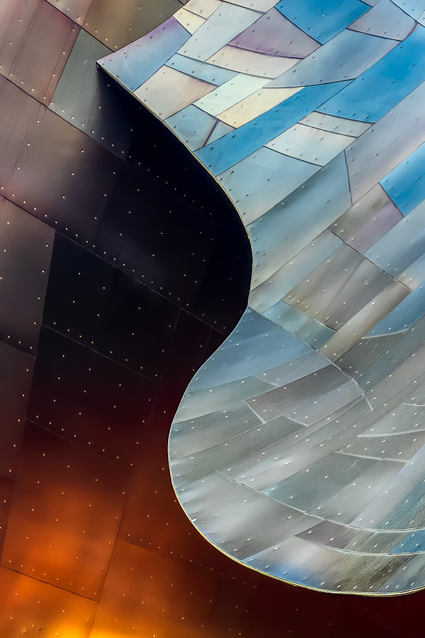
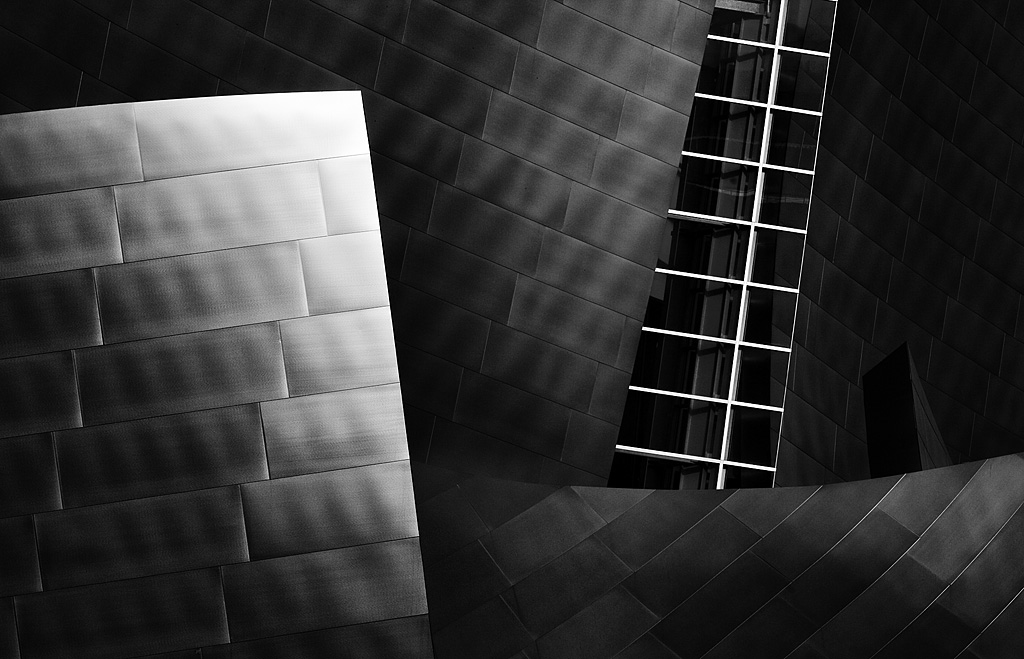
Here is another, where color plays an important role. I just don’t see this Gehry building in B&W, however, the building in LA is a different story. The panels are all silver making for great conversions. See below.
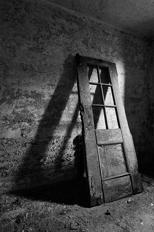
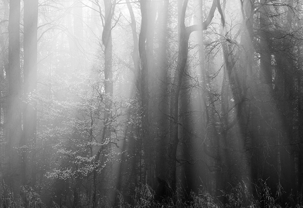
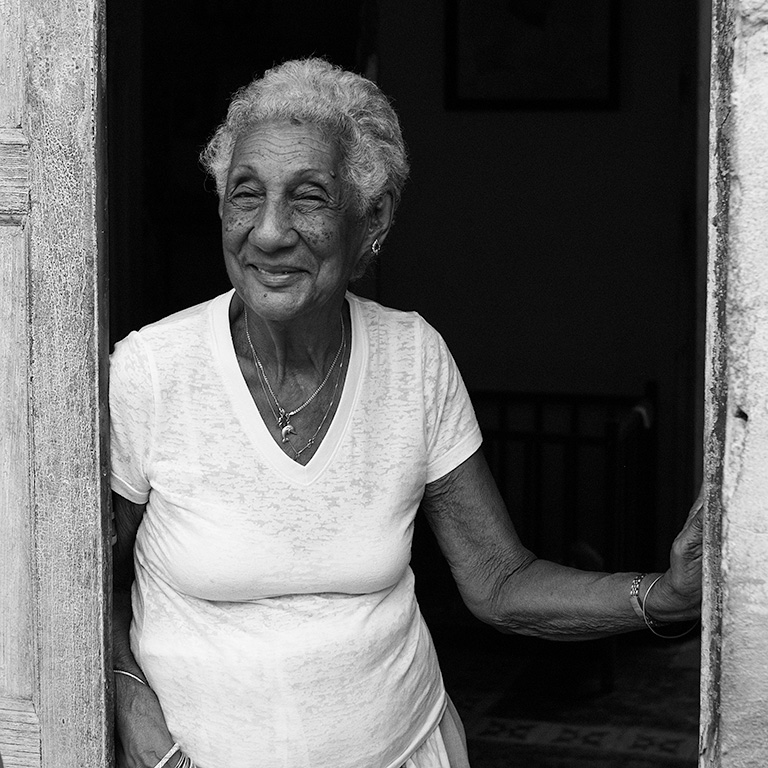
If color is getting in the way of what I am trying to portray, express or show, I will remove the color so the design, graphic, or emotion is more discernible. These images come to mind as examples. The door at ESP does not have much color to begin with so it makes sense to remove it. And the B&W choice does a good job of drawing the eye to what is important, the shadow. The “god-rays” scene is all about the rays and the conversion makes that clear. The dunes are all about line, rhythm, shape, shadow and light. As such, the color just gets in the way. With people, when we remove the color we see into the soul of the person.
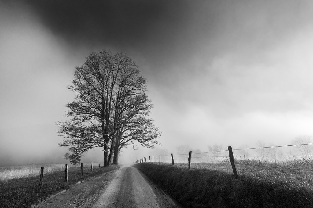
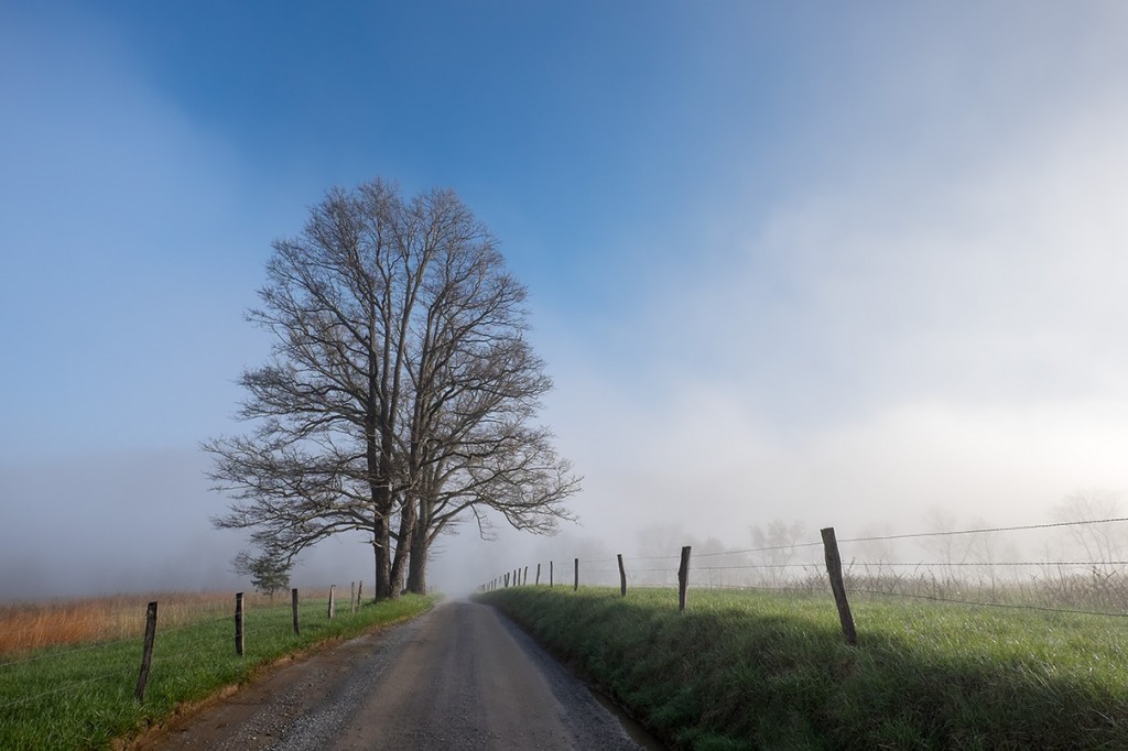
Sometimes an image works in both color and B&W and simply creates a very different emotion/reaction. I posted such an example this spring from the Smokies. I share it here again to make my point.
My suggestion is to make your B&W conversions with purpose. Don’t make B&W images for the sake of creating another B&W image. Not all color images convert succesfully to B&W.
Enough from me, I’m interested to hear what you have to say.
“With color we look at the photography, with B&W we look into the photograph.” Anonymous
[Tweet “Why and when B&W?”]



A great question, and helpful guide.
I would add that sometimes I go by a feeling I can’t quite define. One of the joys of software is that in a second or two you can make a quick and dirty conversion in LR. This allows a sense of what BW might offer to a photograph. This helps when I can’t quite get what I feel, and BW may help: a quick click, and I can assess. Sometimes I have been surprised and like what I see and feel. Then I take the time to do a crafted conversion from the RAW file.
Stephen. So glad you chimed in with your comment. I was going to expand my thoughts to include this as there are indeed times where I’m not sure and I WILL tap the V key just to see… that said, I still think it important to being to think more deeply about why and when so you will start to pre-visualize the potential for B&W in the field.
I think B&W conversion is like a conversation. Between photographer and subject, to emphasize the photographer’s interpretation of the importance of the subject. Between photographer and audience, to enhance a visual connection between them. It’s one thing to go out and look for something to photograph with the intent of converting it to B&W, but an entirely different concept to fully understand exactly why.
Amen Eli.
I agree with the previous comments. JB, did you try this image in B&W? I think that it would be very nice but with a much different feel. Yes, the color does add a lot to the image but do you see the color or all the textures and shapes? I’ve found that I get a very different perspective, and especially emotion, from the same image by converting to B&W. BTW, your Death Valley B&W images have sent me on a B&W bent.
Which in B&W? The post has a number of images… do you mean the Palouse barn image? If so, again for me, it does not make sense. I totally agree that you can get a very different emotion from the same scene. If you go back to a previous post from the Smokies, I showed such an example with the tree and lane shot. That one works in both color and B&W.
Yeah, I meant the Palouse image at the top. That’s the great thing about art – I think it would look great in B&W, you don’t. Neither of us is “correct”. One person’s masterpiece is another person’s garbage.
Exactly.
I totally agree with you that the decision to convert to black and white tends to work best when it is a mindful and deliberate one. For me, I tend to consider it when the ‘story’ in the image is about lines, shapes, or contrasts. As you point out, color tends to distract from that message.
Interestingly, just like Barry thought the Palouse image might work in black and white, I find myself wondering if the Gehry Building image might work. Has some cool lines and shapes as well as tonal contrasts on the left vs right side. And the differing, though relatively subtle, color differences might make for differing tonal values in black and white. Then again, sometimes I think a shot might work and it just doesn’t (this could very well be one of those)! I do love the black and white shots that you posted here……
Interesting thoughts Howard. And thus why I figure my thoughts might morph! I’m still learning too.
I used to associate B&W to winter shots and color to the other seasons but the more I get into this new addiction of mine, photography, I’ll convert a shot to B&W in Photoshop to see how it “feels” to me. If the feeling isn’t right I’ll keep it as originally shot.
Thanks for your comment Al.
A common mistake many people make is waiting until they sit in from of a computer to decide whether a particular image should be color or b/w. While some images may work well in either format, it is a horrible and lazy workflow. First, there may well be compositional and exposure decisions which will differ depending on whether the image is intended for b/w or color, thus may require important decisions at the time of the exposure. Second, and this is related, color and b/w say different things, evoke different feelings. We need to always be aware of those differences and use them to advantage to be express our intentions.
This stuff, of course, requires thought and action when working a particular scene. To skip this important step, to give up full control, is to limit the potential of our photographs. Instead we should be taking full advantage of the whole process, and that includes our brains.
The benefits of previsualizing (if Edward Weston can use that term, so can I!) the final print is that it provides us with a means for continuing and expanding the smooth flow of creation, from discovery and conception to final print. When we do get back home, It offers us a reference point from which to start editing, and a destination towards which to work. It puts us in complete control.
Thanks for weighing in Chuck. I was hoping to hear your thoughts. I’m trying to learn what makes a good conversion more and more so I can do a better job in the capture phase. Did this pre visualizing come naturally to you? Or have you had to develop the ability?
Visualizing takes experience for most folks as we have to develop the skill set necessary to realize our vision, and need to learn the possibilities and limitations of the process. Cole Thompson said it came very easy and natural for him, but I think he’s more of a deliberate and focused person than I am. For folks like me, more seat-of-the-pants type of photographers, it takes concentration and effort, but it’s worth it.
Oh good, there is HOPE for me! Chuck, thanks again for your thoughts!
Hi JB
I agree with the above comments. Which tells the story of the image best, color or B&W?
Which ties together the elements and which distracts? Which ties in with the photographer’s vision? Each image tells a story and the photographer is the narrator.
Thanks Chase. Good thoughts.
Q: When and why B&W?
A: When you feel like it!
To be… Or not to be… With infinite possibilities, options, choices and personal taste and opinions… Our limitations are only bound by our experience, knowledge, visions and imagination…
Not to bring up old school, but not so long ago we had to choose what film, film speed, filtration in the field, and so on… We committed ourselves by the choice of film and the options we were left within the choice and capture. … Then the custom darkroom, burning, dodging, darkroom filtration, exposure, paper and everything else to finally get to what we were looking for… The look, the feel of what we felt at the moment it clicked to the moment we print, post or share with others… Which continues with the digital.darkroom, process and choices we have today.
From first impressions, capture, to final output… the creative process and artistic impressions continues. With digital, current technology and software, we have essentially limitless freedom of choice with the images we take and the artistic visions we choose an image to ultimately have.
There is the time to take the picture(s) and there is the time to continue to develop and process in post process work (chemical or digital darkroom) and the continued development of the images.
Whether choosing b&w, color or whatever artistic impression we are looking for or creating… going through the process is essential. If one cannot instantly visualize in b&w, there are many instant ways to work with a digital file to see what b&w will look like.
If one does not see or visualize, then one is not aware of the possibilities. If we do not know we are missing, will we ever miss it? Our visions, ability to create and visualization continue to develop as we continue to expose ourselves to the endless possibilities. Practice, experimentation and the act of doing … Try it to see if you will like it!
Your examples offer great examples of the endless process from seeing, capturing and to consider the options and look we ultimately wish to have… What appeals to us. How it appeals to others… Great images and post JB!
Thanks for your comments Stephan.
Being truthful to myself, I must acknowledge that I am terrible at pre-visualizing a scene, etc in B&W. That’s not to say that I don’t know that some might very well work “better” as such, but at the time of capture, I do the best I can with what I actually see, & good, bad, or indifferent that includes whatever color happens to be hanging out at the time. (Semi-exception are scenes which are fairly monochromatic, which make it a moot issue.)
I also acknowledge that my visual instinct is graphic. The world is two-dimensional photographically, & when something calls to me & I decide to define a frame somewhere in that view, that is ALL that I see. I assemble the parts as best I can in the same way I did doing stained glass windows.
At least in this portion of my personal process, if I do a good enough job in color, the B&W conversion often is not too much of a different beast. Yes, it will be different (often cleaner which almost by definition is generally more effective), but as graphic elements in a rectangle, sometimes not that much.
FWIW, in my head the reason B&W is so often more engaging is that the normal mental “algorithm” of our brains converting electrical impulses into recognizable scenes, being deprived of what is usually a very informative factor, forces it to “fill in” the information as best it can. Trying to better interpret the image without color engages us on a different level than the “normal” interpretation with color. That the information the algorithm provides is often not color, but sometimes taps a deeper emotional depth is a wonderful quirk of the mechanism.
Interesting and insightful comments as usual Marty. Thank you.
I have enjoyed reading all the comments. No simple answer here. I think that B&W eliminates the distraction of color when it is not important in telling the story. The B&W image needs good structure with contrasting blocks of dark and light as is well illustrated by your pictures of the dunes and the Cuban lady. I do see a fundamental difference. A color picture invites me to come in. Your Smokies pictures included some with roads and flowering trees. How much I wanted to enter that space. To enjoy pink flowers at one step and white flowers further on. A B&W image has never invited me in. Its essence is there to be discovered and admired.
A very interesting take Peggy. Thanks for sharing.
Hello JB, long time no see. lol
Great deep thoughts. And thanks for sharing the rabbit hole that I’ve been stuck in for a long time.