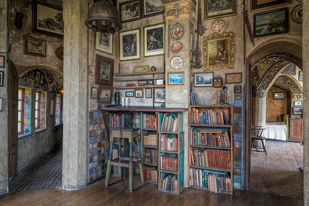
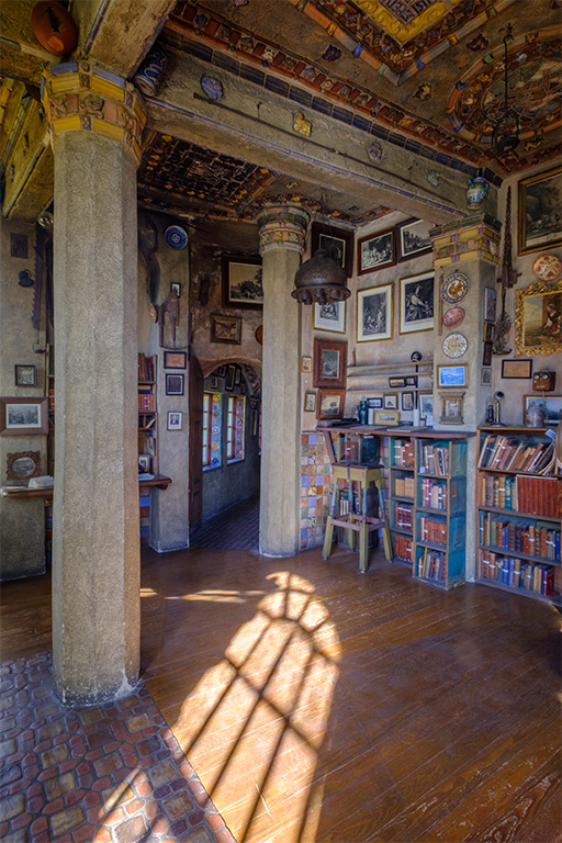
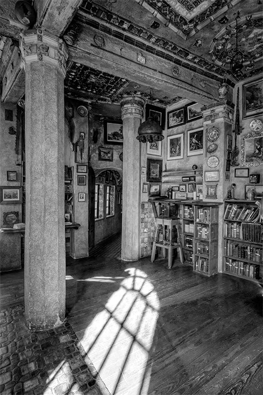
On Sunday, I was leading a workshop at Fonthill Castle in Doylestown PA. One of the participants beckoned me to come see a shot she was excited about. I had to get my camera and make an image of my own! Thank you Lois.
I’ve been in a B&W frame of mind and so I made a version of this scene. What do you think? Color or B&W and why?


I like the color image better.
Those are both excellent images, John ! As to which version is best I think it depends on your original intent. I don’t recall what photographer came up with this notion…but I like it. “Color captures what you saw, while B&W captures how it felt.” So I’ll commit voter fraud and vote for both of them. : )) Slainte !
Very safe Bruce! 🙂 thanks.
Ooohhh. Normally, my inclination is b&w. But this color image is so interesting with all the texture and shades of color. I’ll go with color this time.
(Though I definitely like the b&w image, too…of course.)
Thanks for your input Steve!
John, having been to Fonthill with you, I am more inclined to go with the color version, as I think it more accurately and convincingly portrays the amazing detail in tiles, etc. that were used in the construction of this amazing house.
I tend to agree Gary!
Color. Brings out the rooms details. The B&W makes it dungeon like.
Dungeon can be good no? 🙂
Whatever floats your boat…..:>)
Definitely the B&W. There is a lot of detail to look at in both images. The colors in the books and bookshelves distracts the eye and holds the eye outside and away from the light play at the heart of the image. In B&W the generally level grays of those same books and shelves do not distract from the main bright central sunbeam through the window.
Always good to have a dissenting view! 🙂
Good question JB…sort of like asking which of your grandkids do you prefer!
Charlotte… um… Abby! No, Austin… no… Abby… no…. hum, you’re right!
Hey JB! You know I tend to like color, the more vibrant the better. However in this case I like the BW version much better. The subject to me is the window shadow and the weight of that is greatly enhanced in the BW version. For it to work in color it would have to be a much darker/shadowy image to draw the eye back to the subject. Just my two cents.
Well there ya go! Donnie the rebel! 🙂
I do a lot of B&W, but for this image I like the color better. Since I was there with you, I know how wonderful the colors of the tiles are. You don’t see that in B&W. Just sayin’!!
And I tend to agree, but I like to see what others think and feel.
Color. There is so much unique detail, your eye can rest on each item, and take it in. The B&W sort of lets your eye slide right through it without anything to grab onto.
Thank you Rebecca.
Love the light! Rather a “red carpet” inviting you, your image captures the path of light to guide you within. Both make beautiful strong images! The color captures the “as is” of the present moment and flow of colors. The b&w offers an aged image and classic time as well as a spirit of Fonthill Castle. So, depending on what you wish to portray as the artist and showing of your subject, both images speak volumes! Great work JB!
Always appreciate your input Stephan.
Hard to choose, but I come down on the side of B&W. There are so many different materials and so much texture that I feel the image deserves to make a statement without colour.
Good feedback Anne. Thank you!
I liked both, but I felt the B&H got a better mood.
Thank you for chiming in Rene. It always amazes me how people react to these type of comparisons. It just continues to solidify my feeling that there is always another right answer rather than just one.
John, Both images are great but I actually prefer the color. The detail that is brought out in the B&W makes this image a bit too busy for me.
Thanks for your input Scott.
Color — there’s a little bit of mystery behind the column in the center (Is that a hallway? Where does it lead?) that I just didn’t get in the B&W.
Thanks for your feedback Jim.
Color because of the electric blue accents!
I think I like the color with all the gradations of color. But if I had only seen the black and white, I still would have said “wow”! Thank you for giving me credit for finding that particular view. I had a fantastic time at the workshop.
JB, Having been with you 8 times to Fonthill, I like both versions. With each visit, your vision changes and you become more open to variations of the same scene. Good seeing!
Thank you for your comment LInda.